Role
Product Manager
UX Designer
UX Researcher
Timeline
Feb 2021 - Aug 2021
(8 months)
Tools
Figma, Google Suite, Maze.co, Grain.co
Skills
Contextual Inquiry, Interviewing, Heuristic Evaluation, A/B Testing
Overview
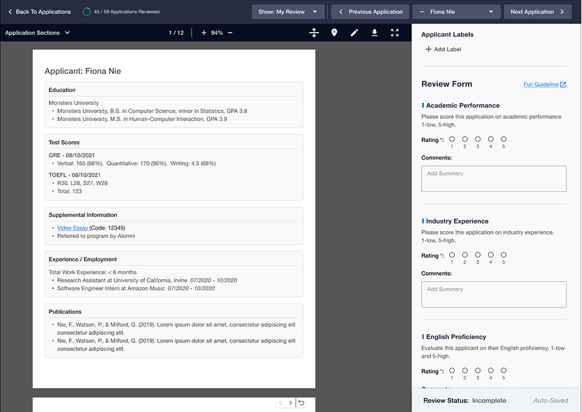
Over the course of eight months, I led a cross-disciplinary team, to revamp Carnegie Mellon University's (CMU) graduate applications review system. I directed and participated in all aspects of the end-to-end product development. This included creating roadmaps, coordinating with stakeholders, conducting research, creating prototypes, and delivering artifacts. Our goal was to design a new system for the admission faculty at Carnegie Mellon so that they can review thousands of applications more efficiently, fairly, and effectively.
Problem
Every year, 10,000+ applications flow through ApplyGrad, the flagship software used by Carnegie Mellon University’s School of Computer Science to select incoming students. It processes applications for 47 master's and doctoral graduate programs across 6 different departments. Major improvements are needed in order to efficiently evaluate the growing number of future applications, which have evolved in criteria and complexity over time, beyond what ApplyGrad was originally designed for.
Solution & Impact
Three major areas were identified, re-designed, and then presented to our clients:
- Note-taking to improve applicant data retention and processing
- Additional data manipulation and visual displays of applications for easy recall
- Basic Visual UI enhancements to facilitate user workflow and information retrieval
Phase 1: Discover
Finding the "Why" and "How" of Graduate Applicant Review
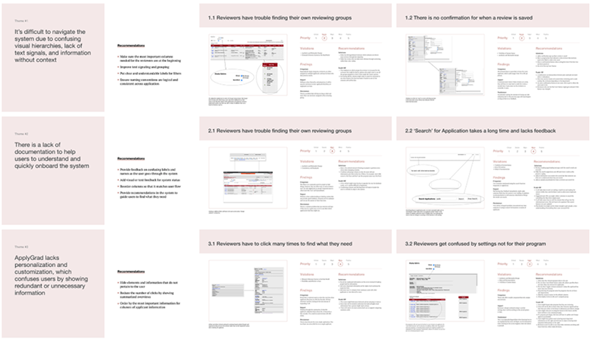
Background research & heuristic evaluations
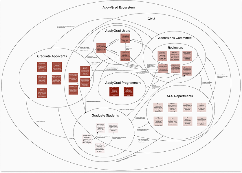
Our team took time to play around in a sandbox version of the application portal to familiarize ourselves with ApplyGrad and all its quirks. We also compiled screenshots and conducted initial evaluations of the product. We were able to create an ecosystem map, which displayed all the stakeholders in the system and the values that they provide for each other using the system. We identified three core persona groups: the reviewers, admins, and applicants, who use the system to make their exchanges.
Admin contextual inquiry: Speaking to the users who use the system the most
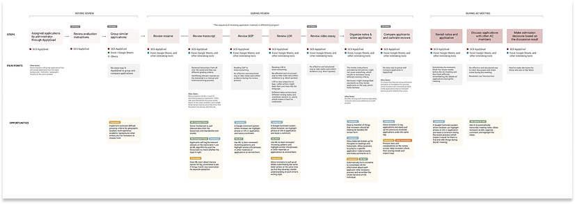
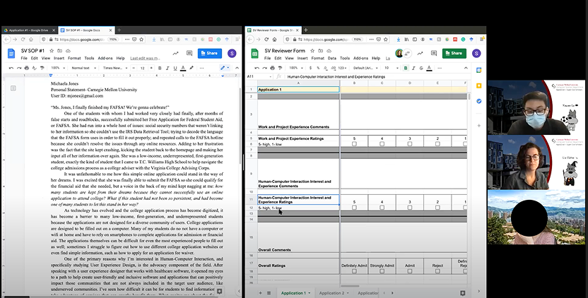
Our next step was identifying steps and observing real user behavior in the system in order to identify efficiency opportunities, so we conducted 19 contextual inquiries with reviewers and admins, representing all 7 School of Computer Science departments. We identified opportunities:
- Improve data comparison & displays for faster workflow: 59% of review time is dedicated to sorting, filtering, and working in an external spreadsheet to clean data.
- Improve on-screen note-taking and annotations: Reviewers take the longest time (days to weeks) to evaluate participants, which includes taking notes and writing summaries to present to their admin teams.
- Create tools to improve fairness and identify merit: A majority of reviewers expressed interest in tools that will help them evaluate for fairness, such as a name-blind system.
The bottom line is that a lot of reviewing is a manual process that requires reviewers to have high concentration and a low error rate.
Phase 2: Design & Evaluate
Speed dating, AI competitive analysis, expert interviews: evaluating openness to AI and automation
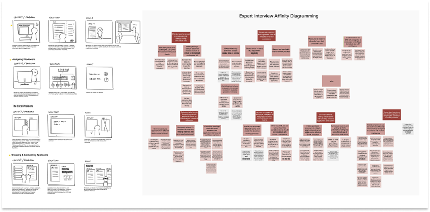
We interviewed 4 reviewers representing 4 different sized departments in the SCS to co-design and solicit reviewers’ general sentiments about some of our pretotypes around machine learning and automation. We also interviewed 3 reviewers using a Wizard-of-Oz approach to see how open they would be to a new annotating & note-taking system to improve the quality of their reviews. We also consulted 3 ML experts, esteemed professors of machine learning, in order to hear their opinions on how to best integrate AI into a legacy system.
- For the most part, reviewers reacted negatively to ML taking part in the decision-making process and preferred it as a tool to check after they have made their own judgement calls.
- Reviewers reacted positively towards annotating and felt that the quality of their review improved when they did it manually. They were hesitant about solutions where AI wrote notes for them, but did appreciate summaries if it were accurate.
- Building solid systems that can use advanced tools or partially have ML requires having clean and solid data. Experts recommended finding ways to streamline how we capture data in the system.
By interviewing multiple groups of people, we learned the boundaries of pushing towards a more advanced system, while staying true to what reviewers valued.
Phase 3: Build & Test
Conducting A/B testing to support our assumptions
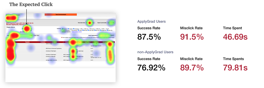
In order to make sure our designs supported user tasks, our team also ran A/B testing with 24 different users, 12 for the old system and 12 for our new system. We then compared the results of basic tasks such as finding an application, evaluating an application, and taking notes for an application. The results were that our new system was 13% faster for users to complete their tasks.
Our design choices optimize for efficiency & impact
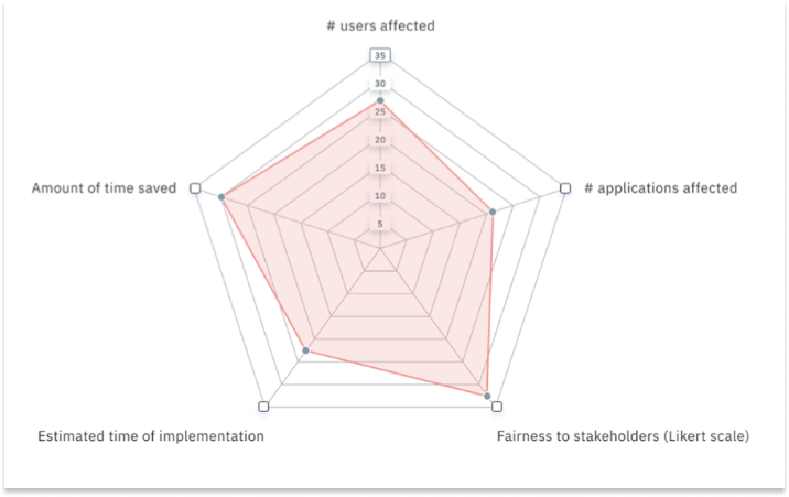
The features we hand-selected into our new application app were based on feedback and considerations such as the number of users affected, the number of applications it affects, the amount of time saved, fairness of system to stakeholders on a Likert Scale, and estimated time of implementation.
Phase 4: Delivery
We delivered our stakeholders a new design system & evidence-based UIs
After we researched and iterated upon our solution based off of user feedback, we:
- Delivered one comprehensive design system with colors, typography, and page template specs
- Created & benchmarked success metrics from 44 UX research study sessions with users so that leadership can quantify improvements and initiate further studies.
- Provided a summary of all studies conducted on the system so that product teams can supply their decisions with hard evidence instead of assumptions.
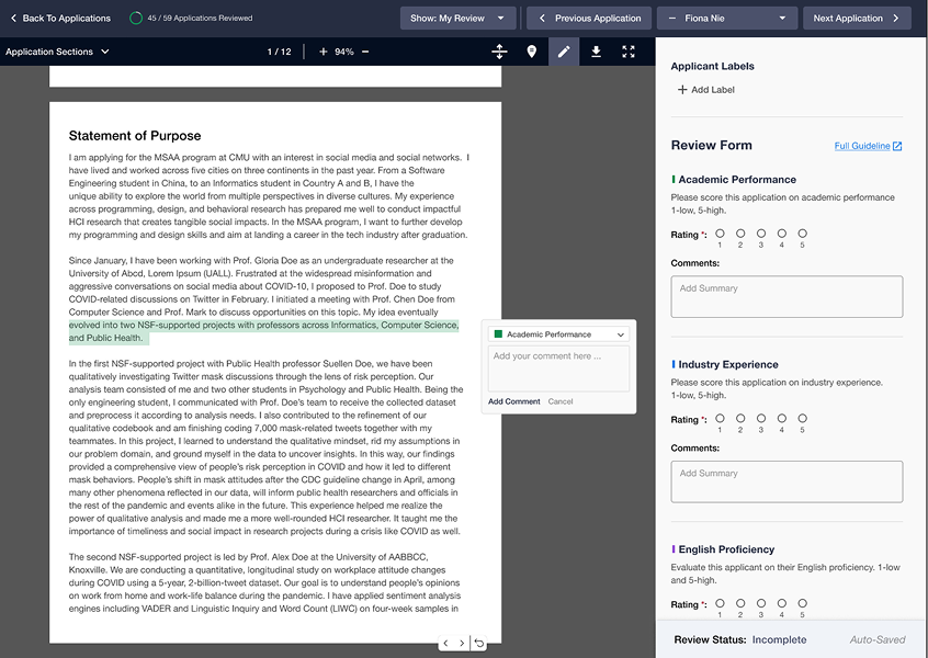
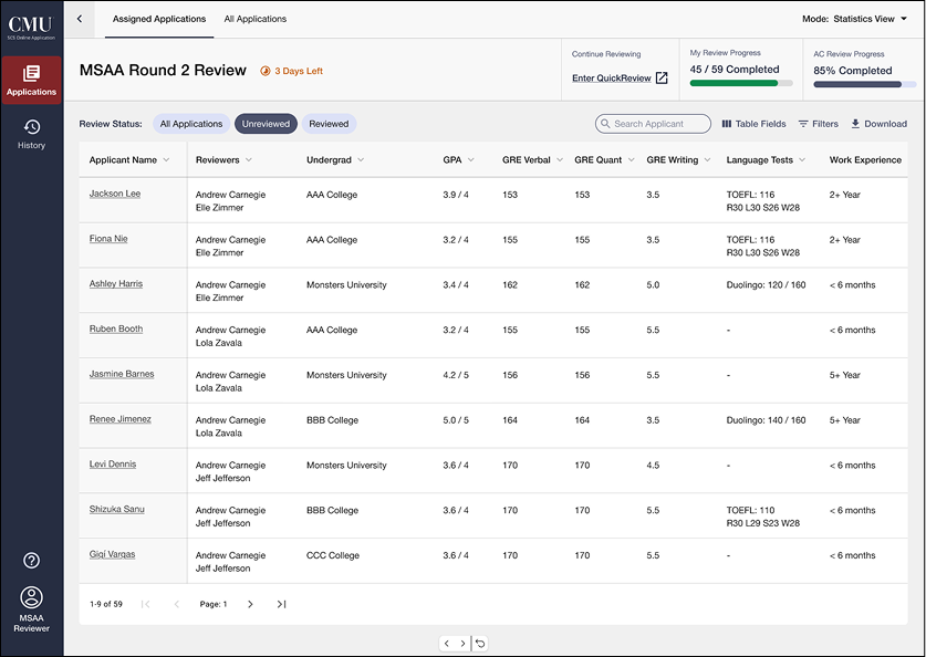
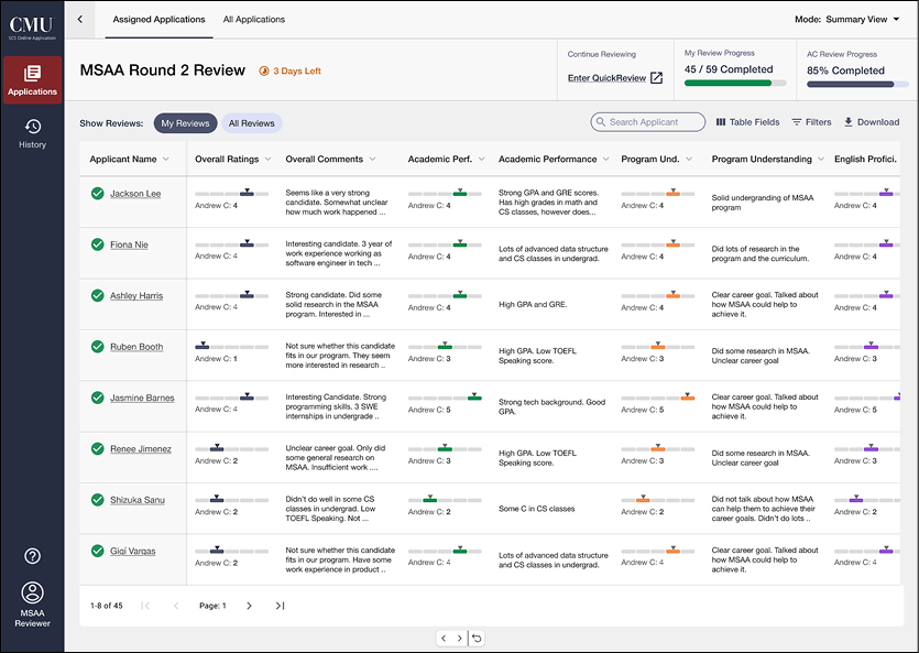
Final Prototype
Feel free to play around with the Figma prototype. You can navigate your way through the prototype as if you were a real reviewer. I recommend opening the prototype to full-screen to get the best user experience.