GovTalk
Bridging communication gap between government & industry
Role
UX Researcher
UX Designer
Timeline
May 2022 - Aug 2025
(3+ years)
Tools
Sketch, Microsoft Office Suite, Zoom, Jira
Skills
Interviewing, Surveying, Journey mapping, Persona creation
Overview
I was the lead researcher and designer for a government entity's enterprise communication features that aimed to improve collaboration between the entity and industry product teams. Most of my work focuses on building communication tools that would improve real-time interactions, conversation tracking across multiple legacy applications, and long-term interaction trends.
Note: Because this government work is confidential, I'm limited in what I can share. Reach out if you want to hear more, and I'll share what I can.
Problem
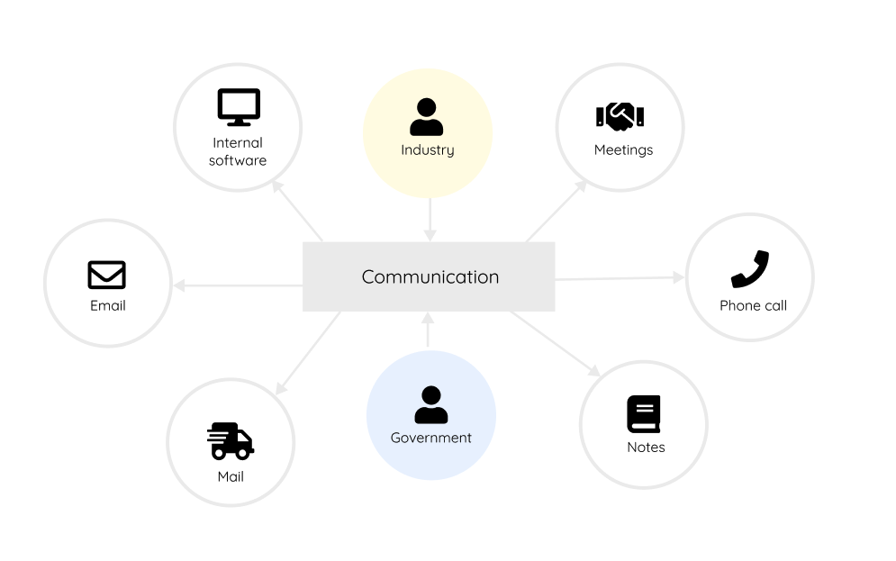
High-quality communication between governing entities and solution developers is associated with improvements in quality, resulting in the market having access to safer and more effective products. Traditionally, government agencies receive physical mail, emails, and various other information. This decentralized communication process hampers collaboration to develop quality products and services.
Results & impact
Because I was involved as both a researcher and designer, I was able to create designs and measure its impact on business strategy. Across the various projects, I created products that:
- Improved the user level of ease scores by 13%, which indicates an increase in usability
- Reduced tool-switching friction by 25%, resulting in an increase in efficiency
- Satisfied potential user loyalty of at least 60%, fulfilling long-term retention goals
Phase 1: Uncover the Problem
Optimizing communication is a shared goal
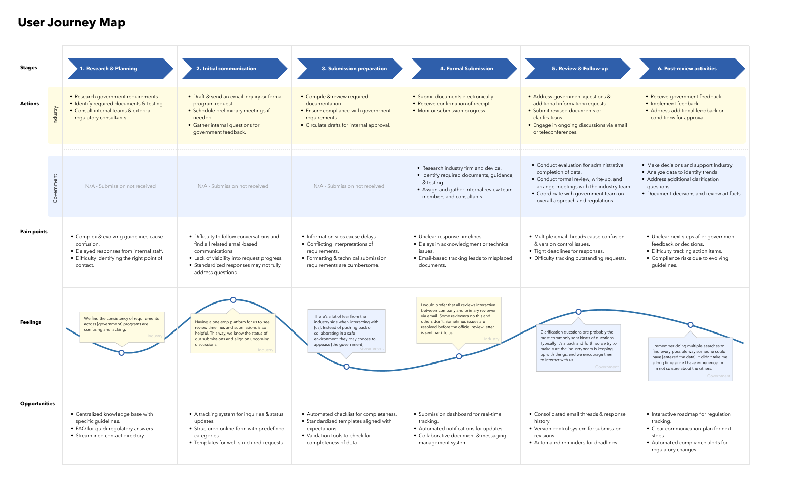
More frequent interactions with governing bodies often leads to better solutions. Users desired to see their communications more closely tied to its journey through various regulation programs. It is valuable for product teams to connect directly with regulators, but also to track omni-channel conversations and regulatory programs involved in the lifecycle.
“ Industry users and [government] have the same goals. We both want to get the solutions out quickly, using the least resources as possible.” - User highlights that communication improvement is part of a larger, mutual goal
Three user needs that design needs to fulfill
After conducting multiple interviews with our users, studying past desk research, and playing in the sandbox environments, our team grouped our insights and established three user needs:
Users need real-time communication so that they can proactively address problems.
Users need to track and consolidate all product development conversations.
Users need ways to request for help or resources while working on their solution.
Identifying user needs with thorough research
In order to prevent delays and reduce risk when developing a system, we have to understand the current workflow of oversight entities and innovation teams. I conducted desk research by sifting through dozens of past user sessions to understand the legacy systems that government worked in and to avoid repeating work. I also familiarized myself with the government's work applications by using sandbox environments, so that I could understand the users' perspective better. In addition, I conducted one-on-one interviews with four users to validate ideas about how to re-imagine their communication workflow.
Phase 2: Explore Solutions
Three different solutions for three different needs
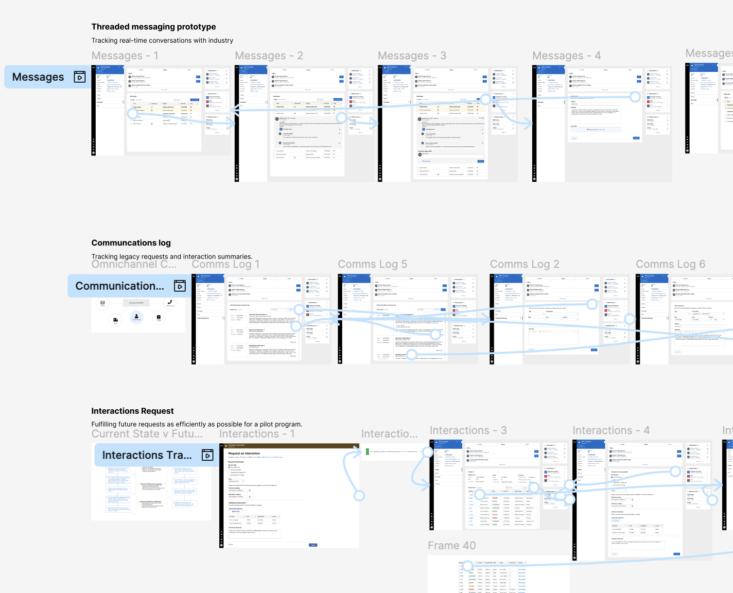
There are always multiple solutions to address the different user needs: need for real-time communication, tracking communications, and requesting for help. Working with the business and developers, we decided to translate each need into its own design because each need was different enough that a single fix wouldn’t work. This helped us stay aligned, reduce confusion, and build solutions that directly solved the right problems.
Usability testing the threaded messaging rapid prototype for real-time interactions
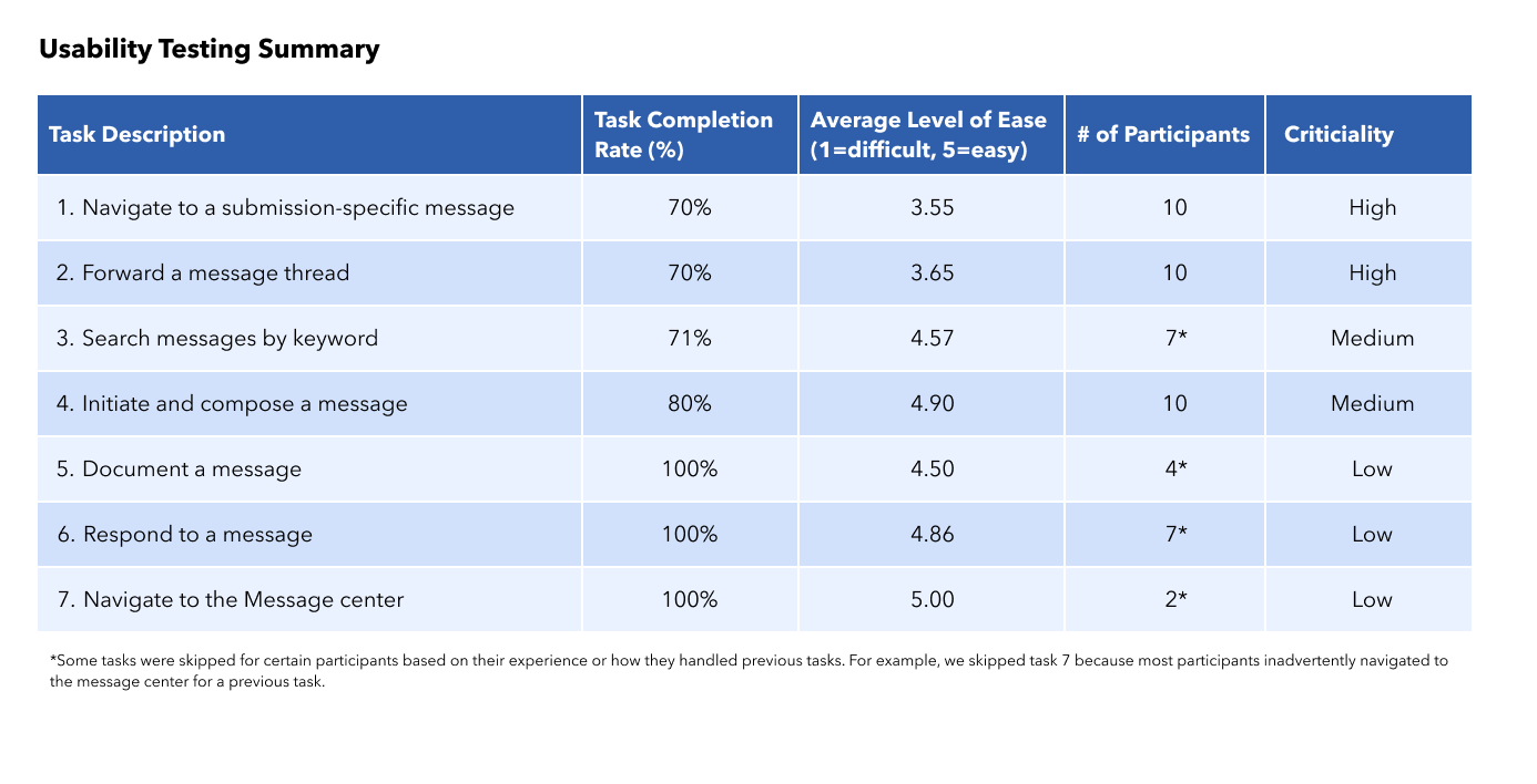
I worked with the developers to evaluate the effectiveness of a messaging rapid prototype. I scheduled, interviewed, moderated, and took notes for each of the 10 usability testing sessions with government users. I guided them through the tasks, which involved finding messages from industry users, composing messages, and searching through messages for answers. As they walked through the tasks, I asked them to think aloud and tracked their behaviors (e.g., how quickly they completed each task, self-reported satisfaction of each task, etc.) and probed them to find the "why" behind their answers.
I found that users had the most difficulty locating messages and understanding who had access to the messages. My re-designs focused on creating a clear navigational path to messages and clarifying the visibility of messages.
Prototyping & testing a summary log for tracking multi-channel legacy integrations
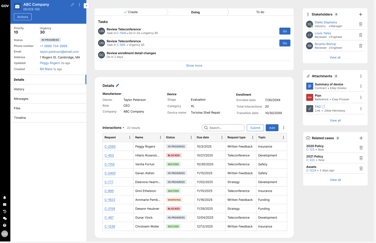
I worked with clients on developing a proposal for centralizing interactions. I used informal, collaborative peer-review to co-design the solution with 5 other people from the business & UX team. Over a few months, I led design discussions and created wireframes on screen. We would use methods like dot voting, focus groups, & ideation sessions to find the best solution. From their feedback, I was able to iteratively adapt the designs to better accommodate user needs.
Creating & user testing a new request workflow
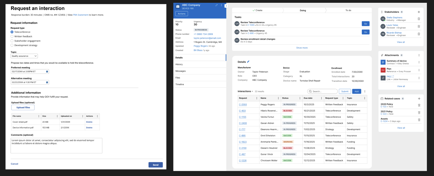
In order to address industry needs for communication requests, I worked with a product team through Jira to develop an end-to-end web app solution. I designed UIs that could help track long-term interaction requests. I analyzed feedback from user testing sessions with 25 government users. I studied how they accepted and fulfilled requests from users through the systems and then iterated upon the designs. I also designed web forms for industry to send in information.
Phase 3: Evaluate Designs
Ultimately, all three solutions were supported by evidence from user testing, so the teams continued to develop for all three scenarios. As there were more design and research demands:
- I wrapped up my work for the messaging prototype by delivering a full research report and minimally-viable product design solutions to improve it.
- I created a comprehensive PDF with high-fidelity designs and documentation for additional features to explore.
- I delivered multiple high-fidelity design assets for the government's workflow to track interactions, which supported cross-functional alignment and accelerated handoff to development.
Measuring outcomes
- When testing the messaging system, we were able to see a 13% improvement in user satisfaction scores. Based on historical data of 15 users, we calculated a benchmark of 67% satisfaction with the communication in the current system. Compared to the usability test we conducted with 10 users, which had an average satisfaction score of 80%, we saw a 13% improvement from the baseline.
- The summary log prototype was able to reduce 25% in tool-switching friction. Past studies on a similar tool in the legacy system showed that users on average were switching ~12 times between various documents and tools to record data. With the new summary log, people on average were switching ~9 times, drastically reducing the need to add longer notes in other programs.
- Developing a long-term interactions workflow was able to get 60% of user loyalty to the platform. While long-term retention data wasn’t available due to the early stage of developing the program, 60% of test participants expressed strong intent to use the new workflow regularly. These are strong indicators of potential user loyalty.
Final Design Choices
The images below are not associated with being used by the government. They just show similar design ideas and exemplify the kind of complex flows I worked on.
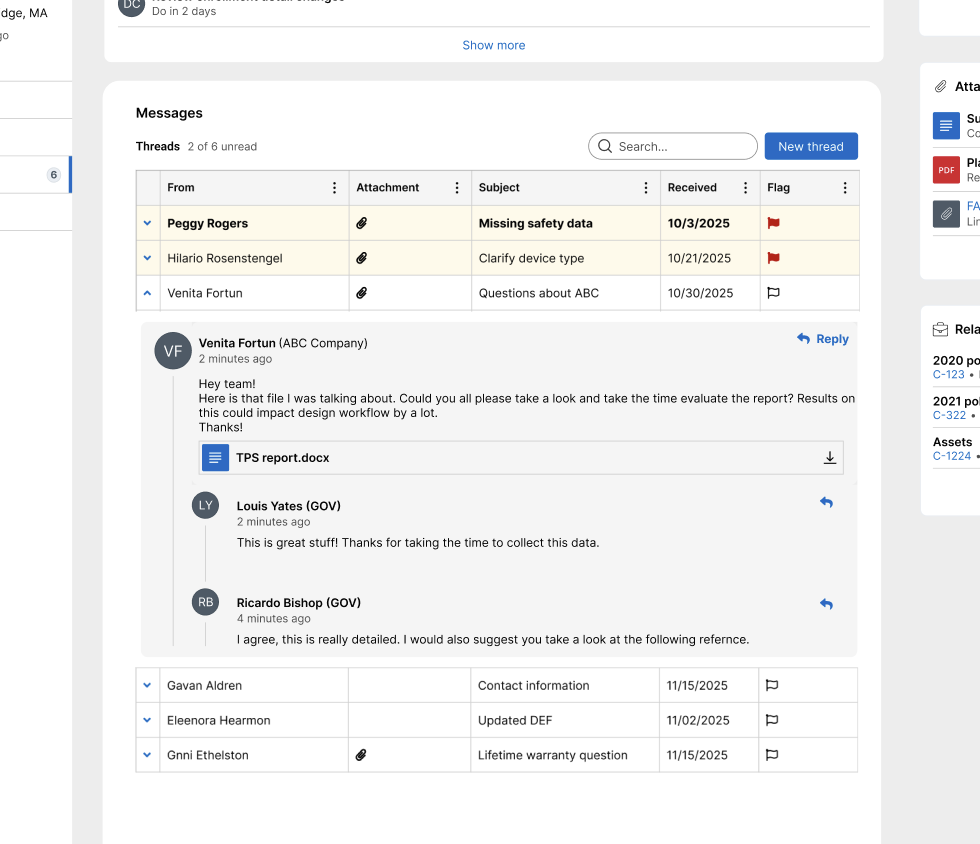
Threaded messaging prototype
For the threaded messaging prototype, I focused on design choices that support real-time interactions while keeping conversations clear and organized. Features included:
- Threaded messages grouped and ordered so it’s easier to find responses
- Subtle timestamps and indicators keep users aware of activity
- Clean visual hierarchy reduces clutter and supports quick scanning
- Ongoing conversations next to submission information for understanding context
Multi-channel communication log
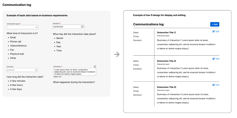
I improved a multi-channel communication summary log to make it easier for users to track conversations across platforms. The updated design brings clarity to scattered messages by organizing them in one place, highlighting key actions, and reducing information overload.
- Grouped messages by channel and time to improve readability
- Added filters and tags to quickly find relevant updates
- Highlighted important actions and follow-ups for better visibility
Long-term interaction request workflow
I improved the design of a long-term interaction request workflow to make it easier for users to plan, submit, and track extended engagements. The updated flow focuses on clarity, reducing back-and-forth, and giving users better visibility into request status and next steps.
- Simplified form inputs and grouped them by task to reduce cognitive load
- Added progress indicators and status updates for better transparency
- Designed confirmation screens and alerts to reduce uncertainty and follow-up questions