
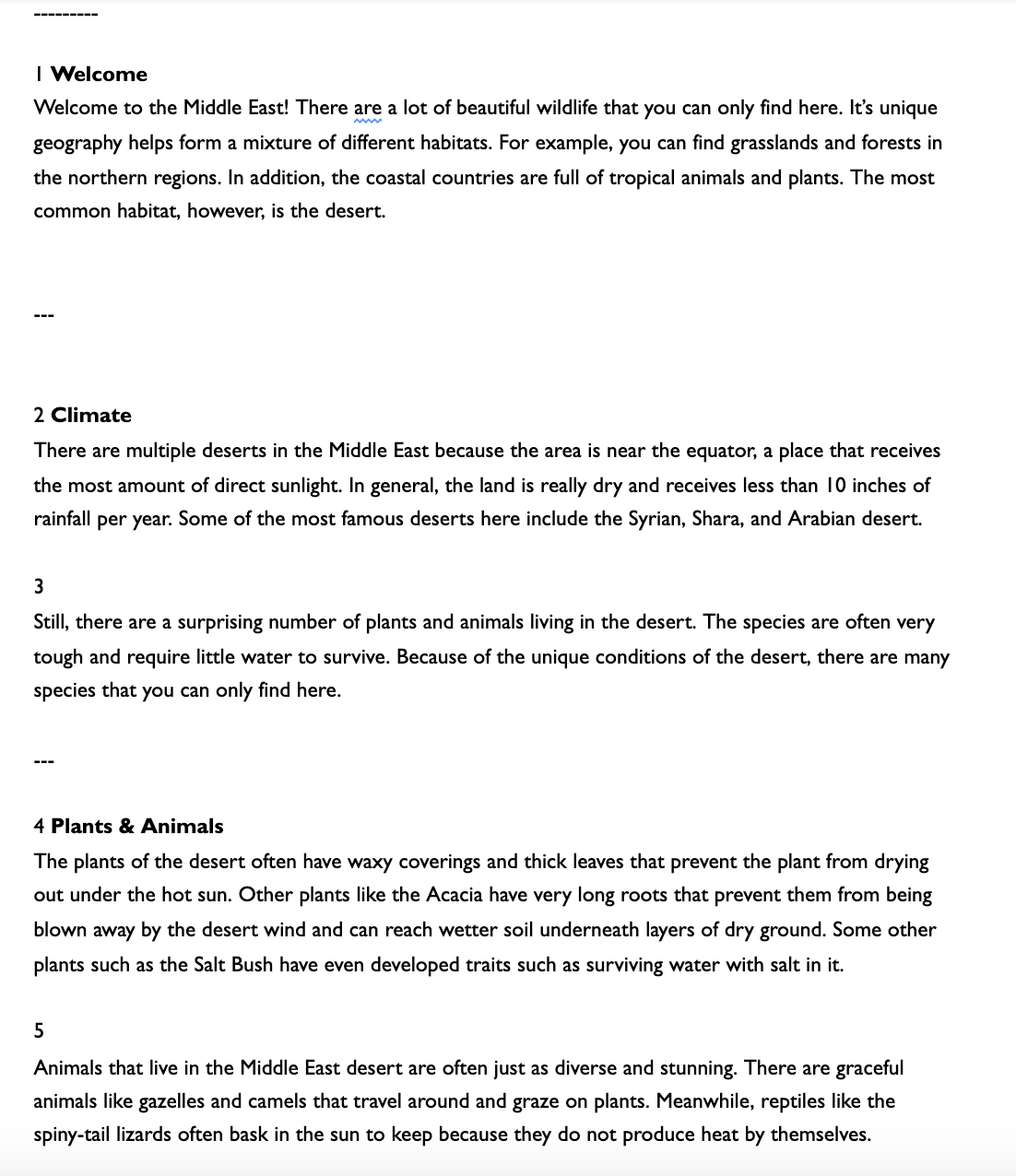
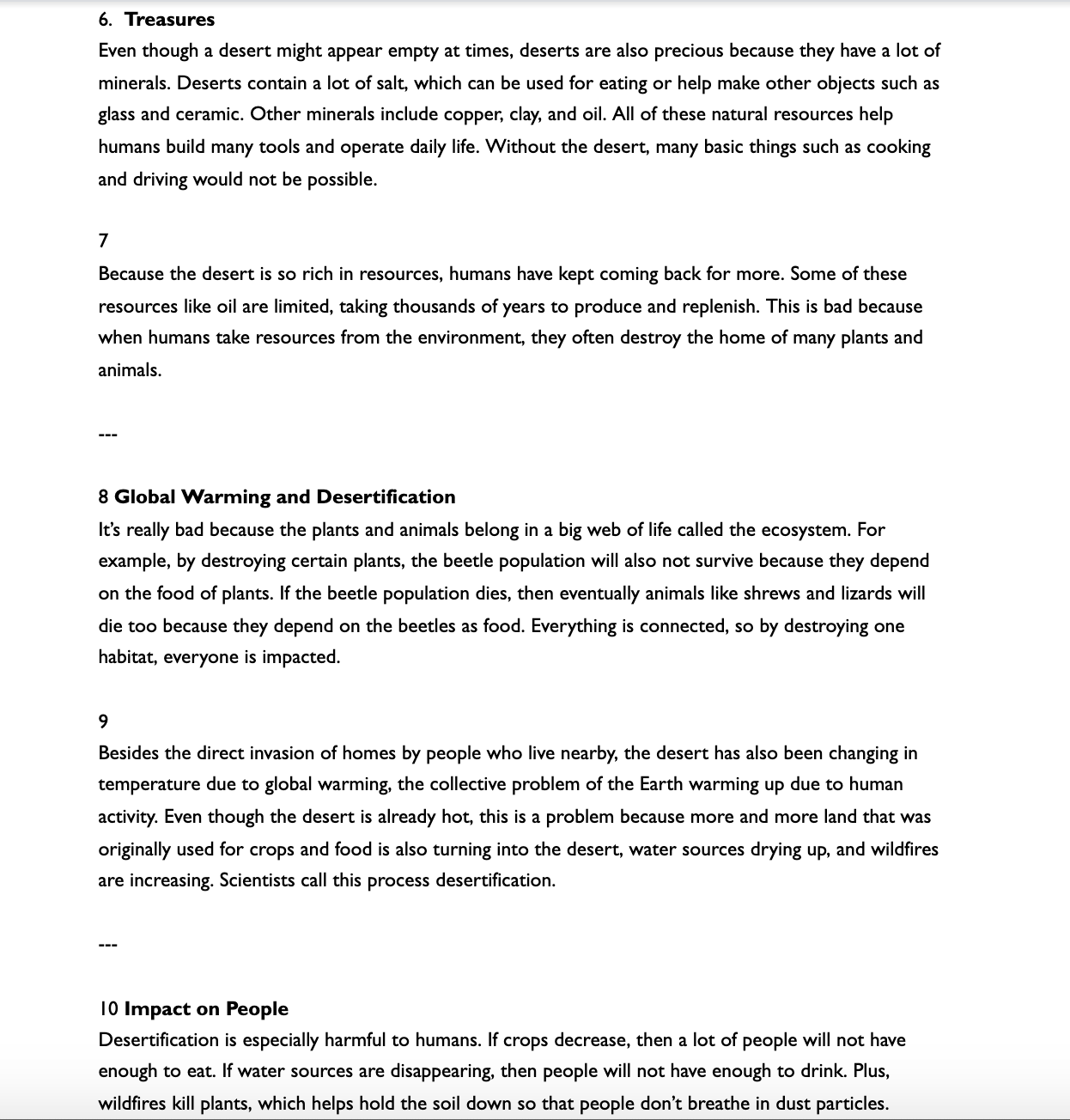
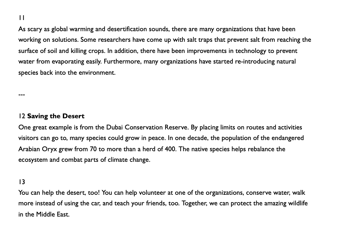
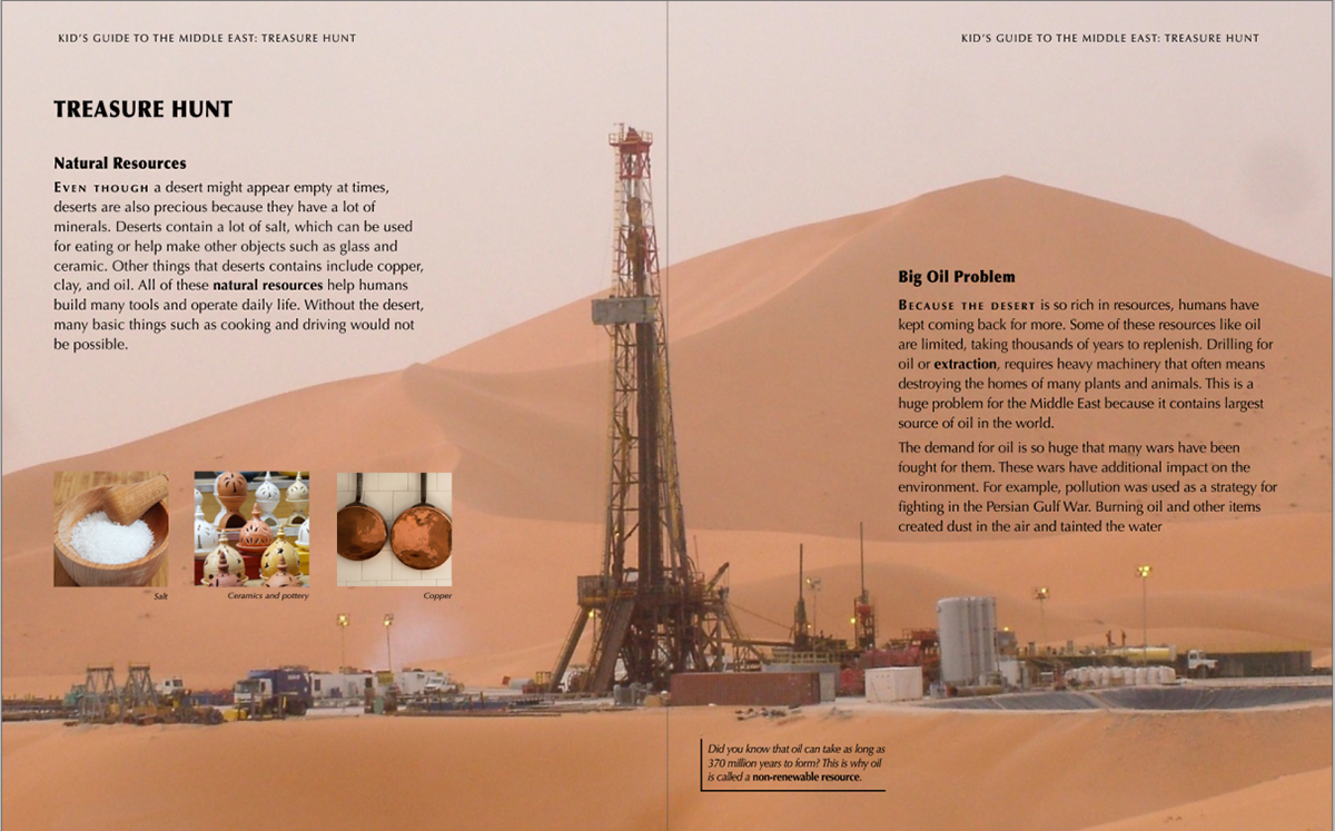
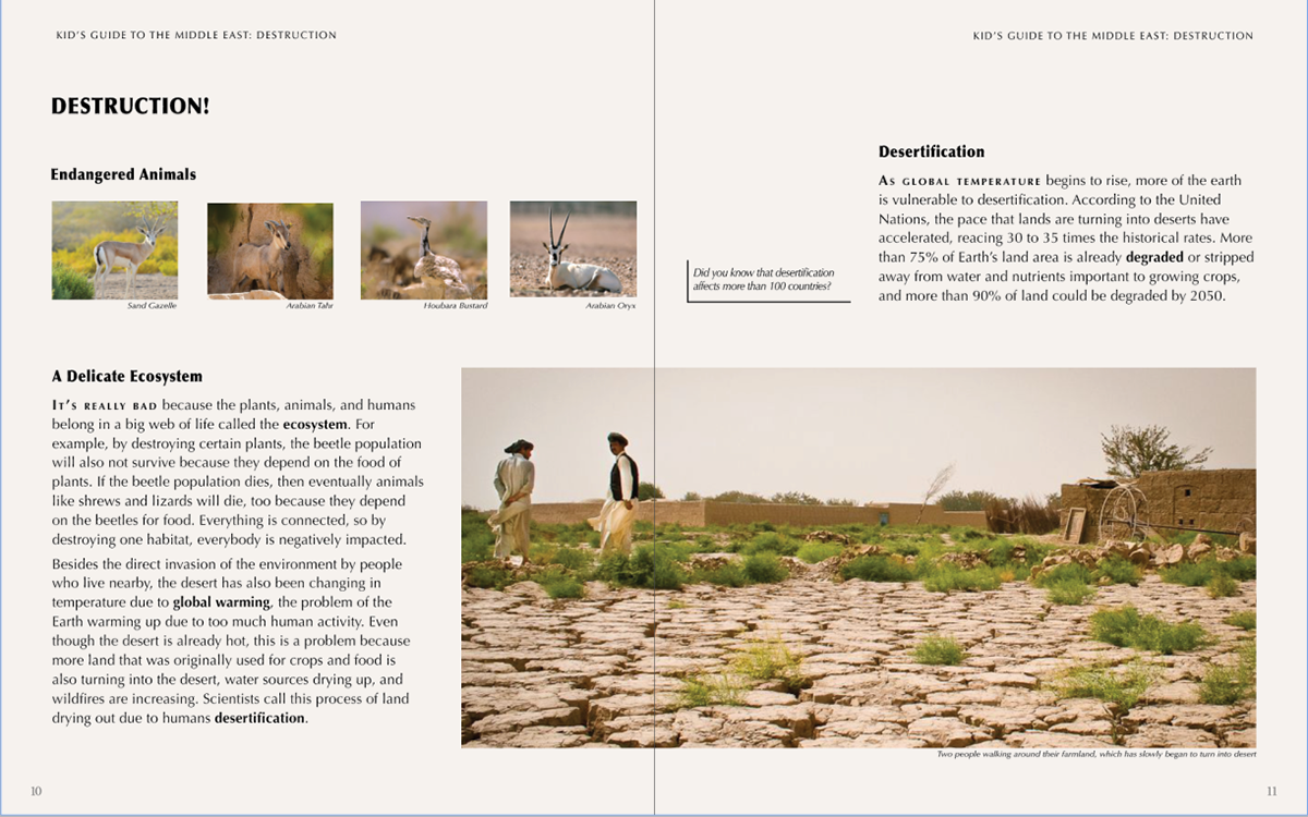
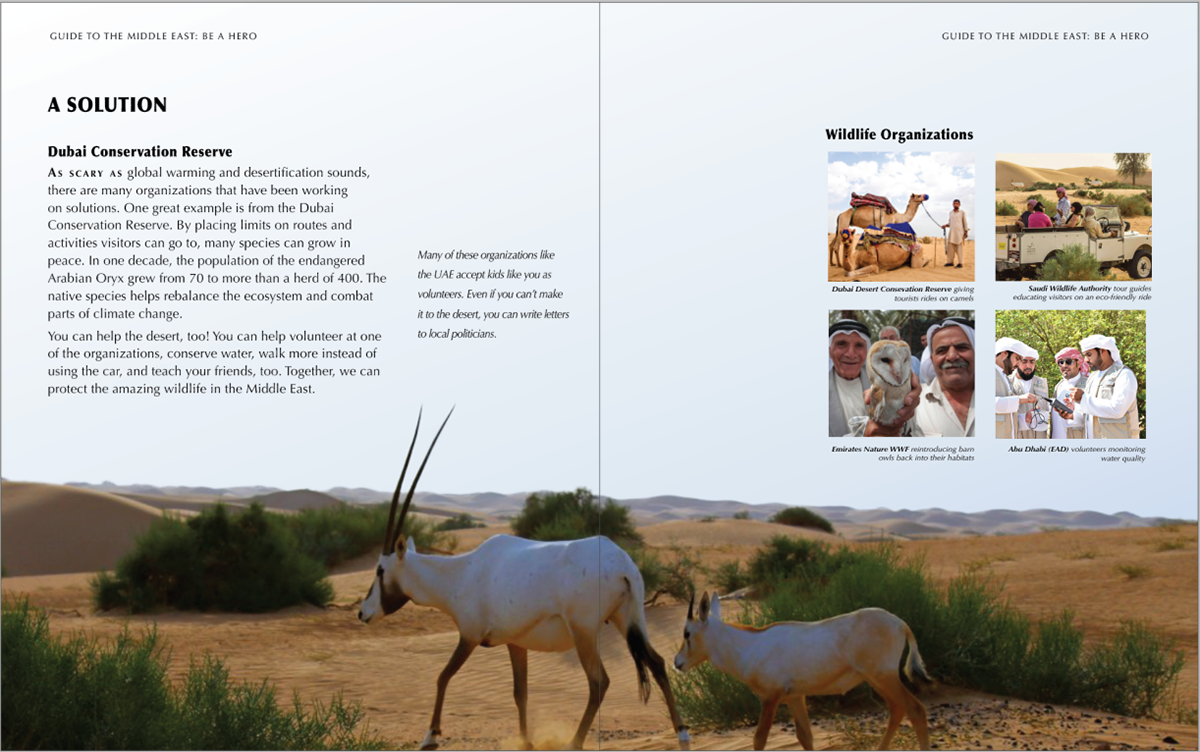
Overview
During the fall semester, I took a class called Document Design. As the final project, I was tasked to make a children's book on the Middle East. Over the course of a couple of weeks, I researched the area and domain, generated content, and then created many iterations of how I wanted the information to look.
Role
Designer
Timeline
Dec 2020 - Dec 2020
Methods
Thumbnailing, Wireframing, Grid Layout
Tools
Adobe InDesign, Photoshop
Media
Introduction
Over the course of a month, I researched the domain, problem space, and generated content for a physical book as a class project in Document Design in graduate school. Along the way, I learned how to use Photoshop to make cutouts of different animals. The pictures were cutout from images from copyright and royalty websites such as Pixabay and Unsplash.


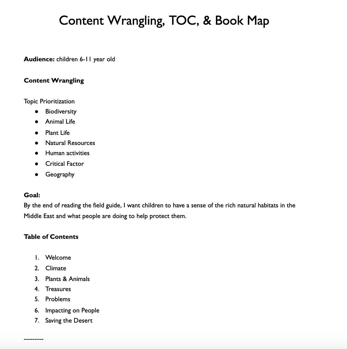
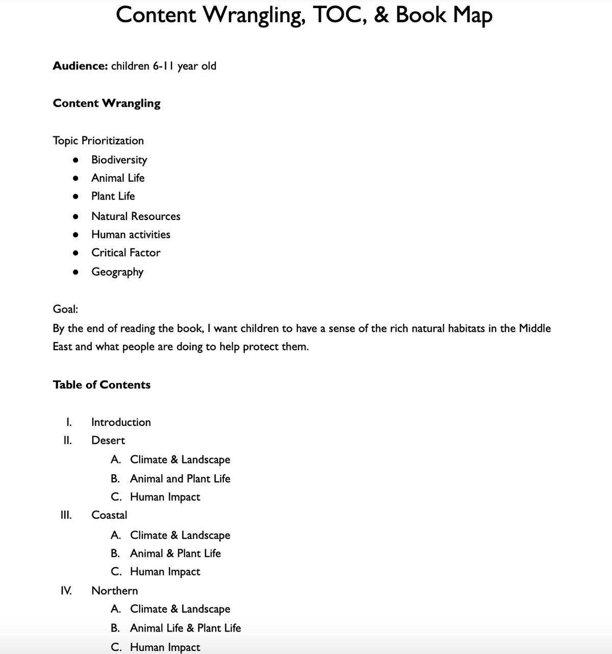
Content Wrangling & TOC
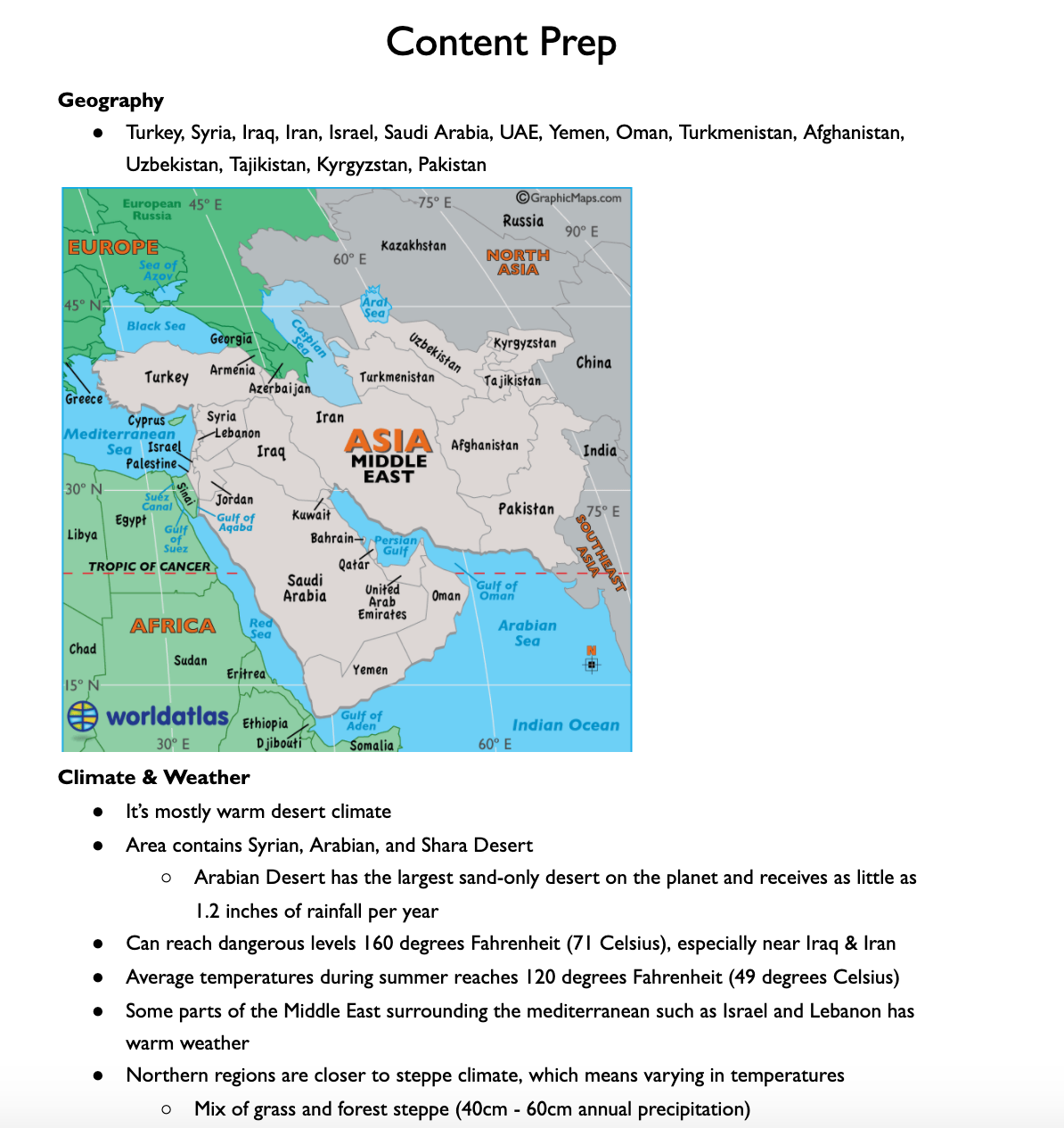
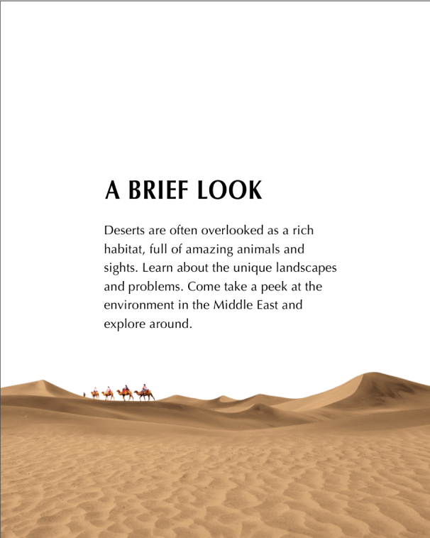
The first step to designing a book was to sit down and research about what I was writing. Honestly, I don't have extensive background in Middle East history or culture, but I wanted to represent the place in a respectful way. This meant doing research about the environment, which is part of the required assignment, but also researching the larger domain. Ultimately, I came up with enough content for the 14-page book and rewrote sentences until it was concise and understandable to children, my chosen audience for the book.
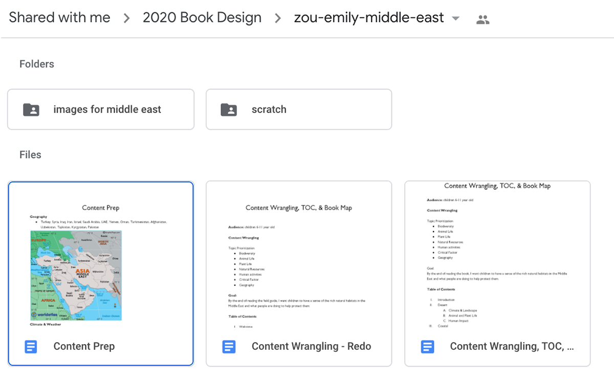
The next step was to collect images for the book. Originally, I only collected around 12 to get a general look and feel. I made sure everything belonged to a similar palette in order to make the design feel cohesive. However, the collection of pictures slowly expanded as I decided on more graphics.

Thumbnailing & Book Map
First, I made a book map to layout the general content of the book. After that, I made thumbnail options for the different content that I could display. Each round of thumbnails, I got critiqued and adjusted my designs accordingly.
For the book map, the feedback was that I should add slightly more details in what I was going to tell the readers. Because I was short on time, I instead went back to content wrangling to figure out the content of each page.
The next stage was showing A/B options for 2-3 interior spreads of the book. Although my design and content was varied, it lacked a grid structure, which makes it looks like it belongs to the same book.
In the last design, the professor pointed that although my pages are varied, all the boxes and placeholder content could use more of a uniform grid design.
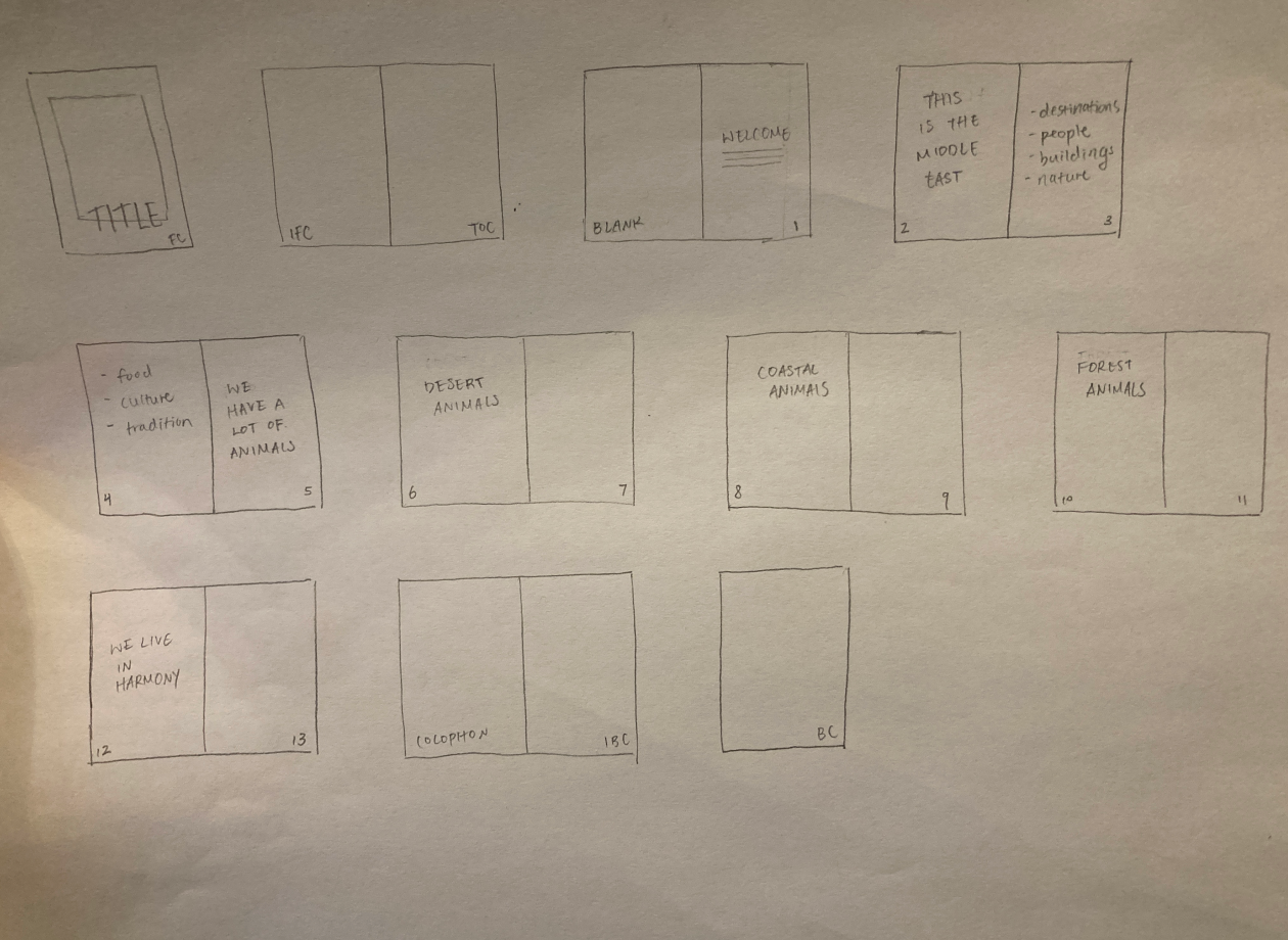
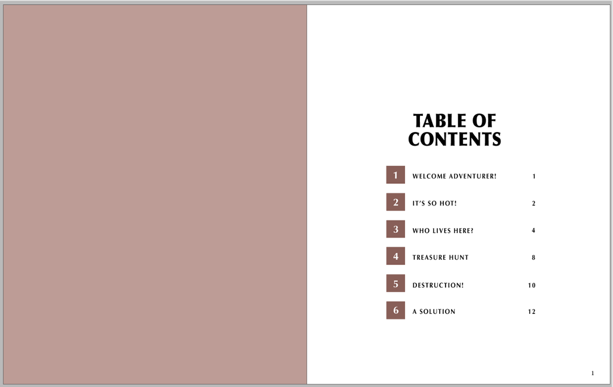
Book Map

2 options for 3 interior pages
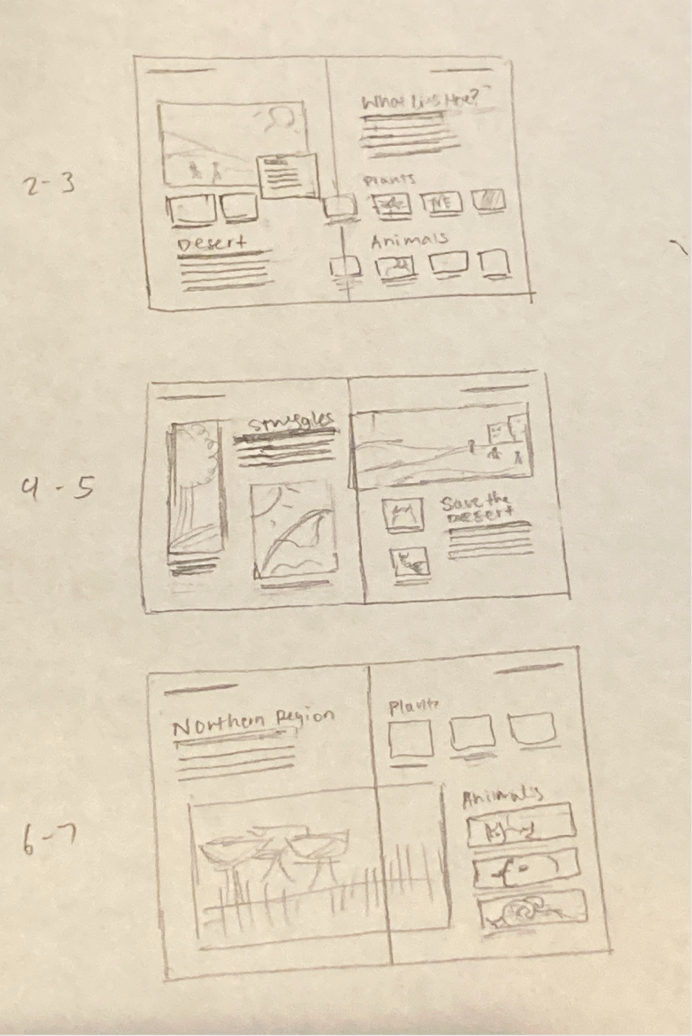
iteration of 2-3 Pages of interior spread
Interior Spread
After the rounds of feedback, I used a 2-column grid to display the content. I learned that all paragraph text in a book should be the same length for consistency purposes. Most of the feedback at this stage was about structuring the book to fit the audience that I picked, which was children from 6 to 11 years old. Although I followed a grid design, the book isn't very appealing at this stage.


Iteration
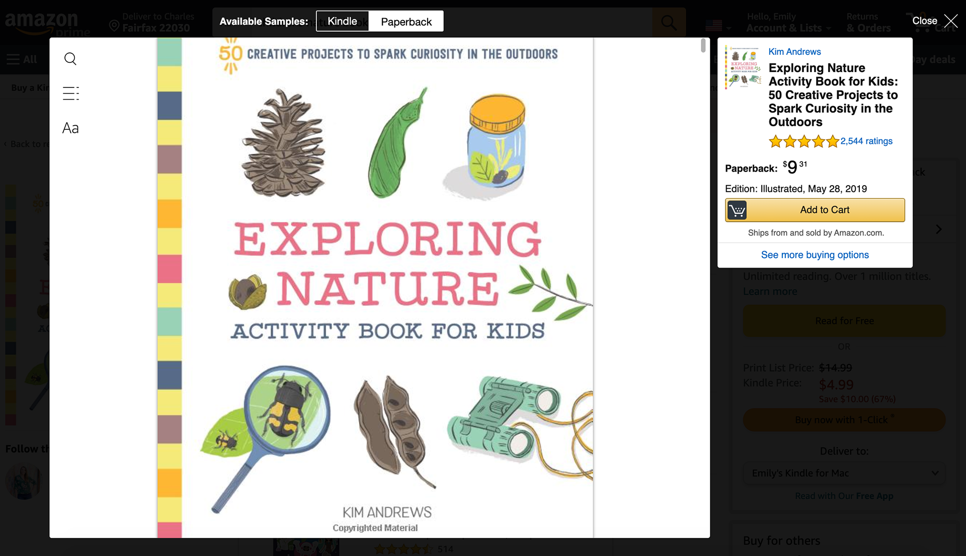
I went back to the drawing board. I looked through dozens of children's books on Amazon because they would sometimes have previews of the interiors on it. I chose this method because it was faster and safer than going to the library to borrow books during the coronavirus pandemic.
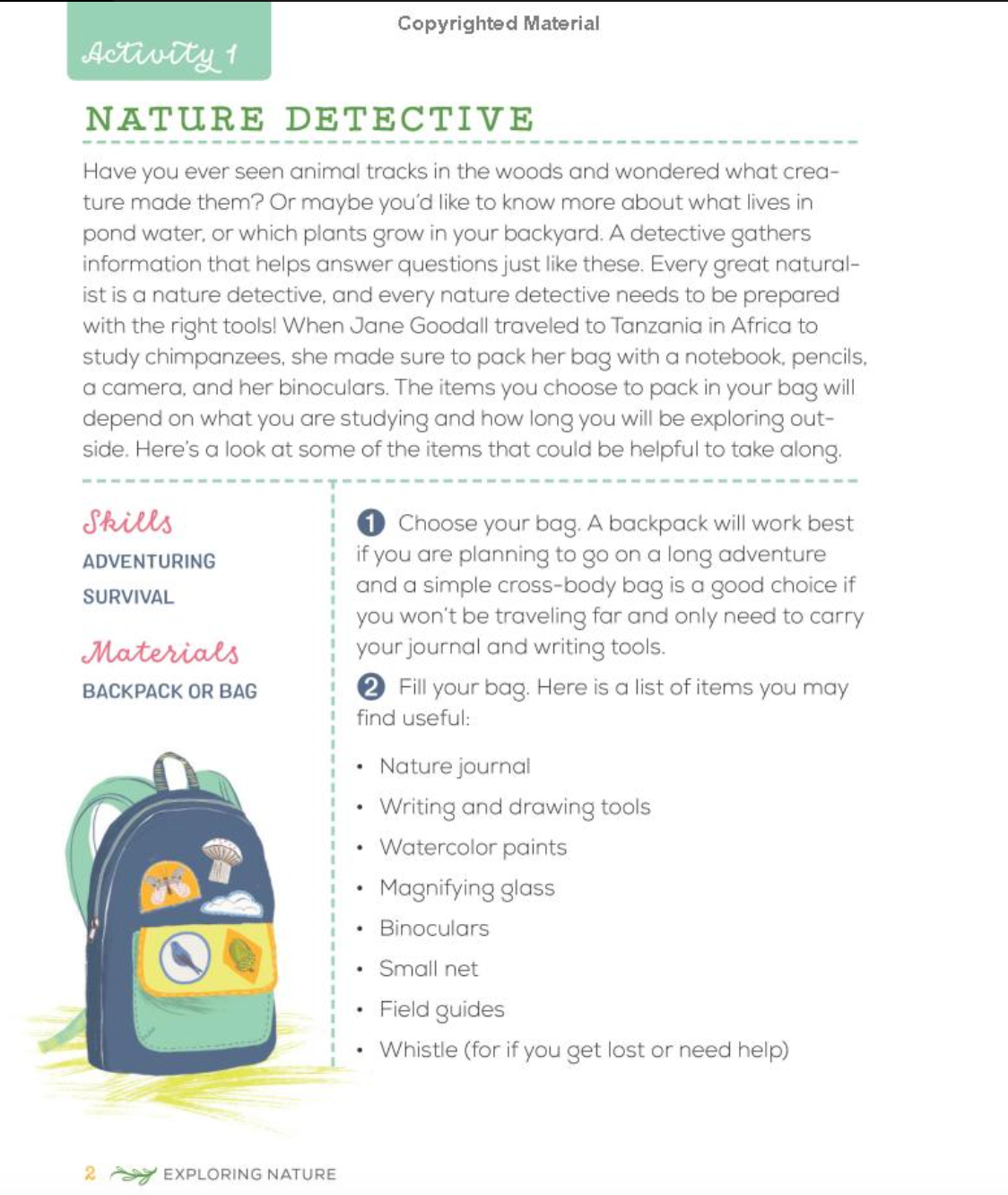
I borrowed techniques such as colorful pages and images and text that pops out. Overall, this design got more positive feedback. However, this design lacked a bit of consistency and looked to "boxy," instead of seamless. Some pages seemed to have a lot of whitespace while others seemed to be crammed with information. This is hard for readers to follow along to.
Running out of ideas myself, I went to office hours to figure out what else I could do. One solution to adding whitespace was to decrease font size. Even though the font looks fine from far away, Professor Karen Kornblum told me that fonts will be pretty big on the physical book design. In addition, she showed me a trick to keep content consistent: put the most important things on a singular line.


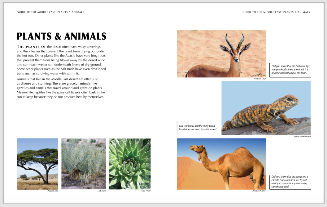
Final Product
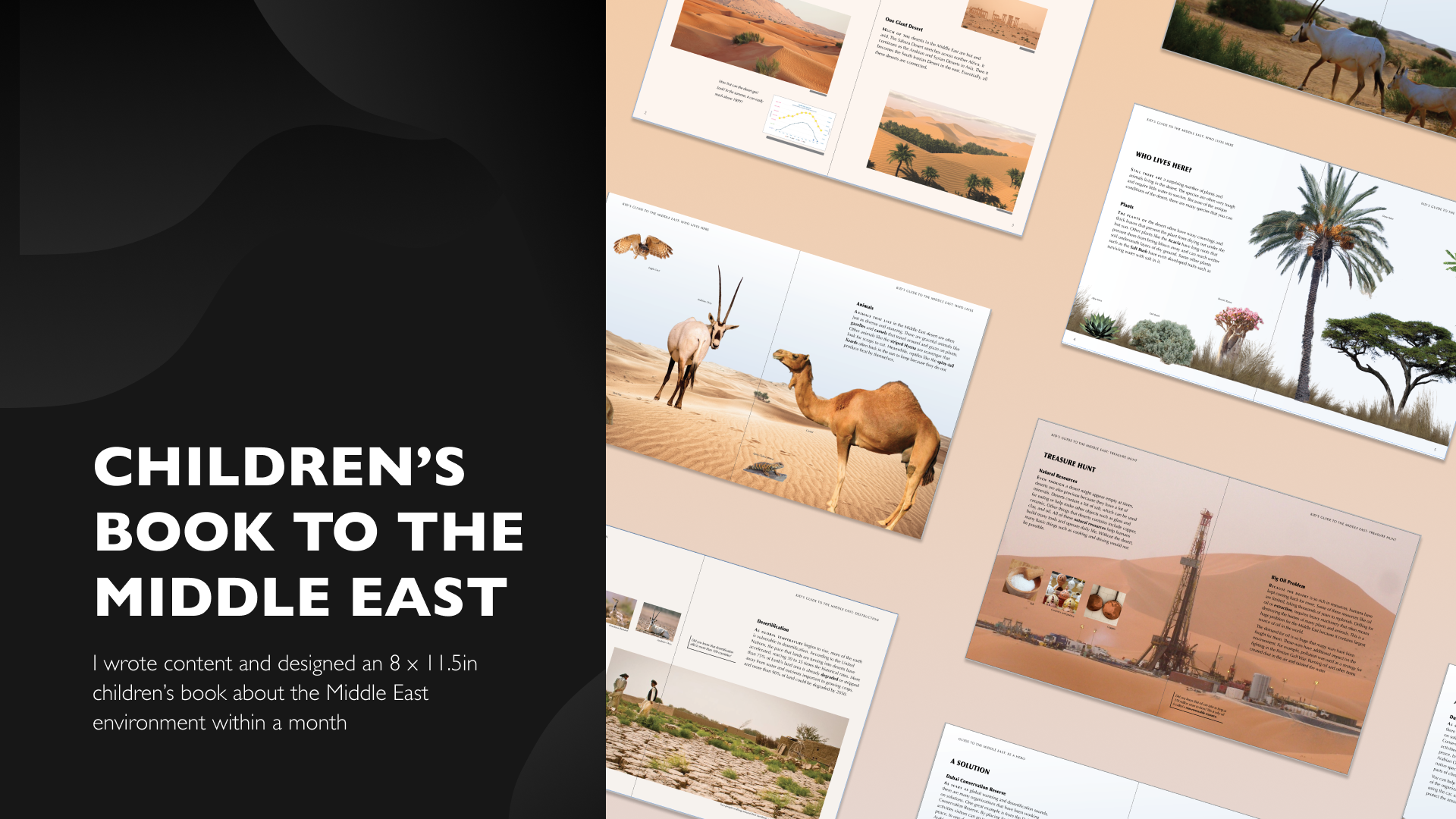
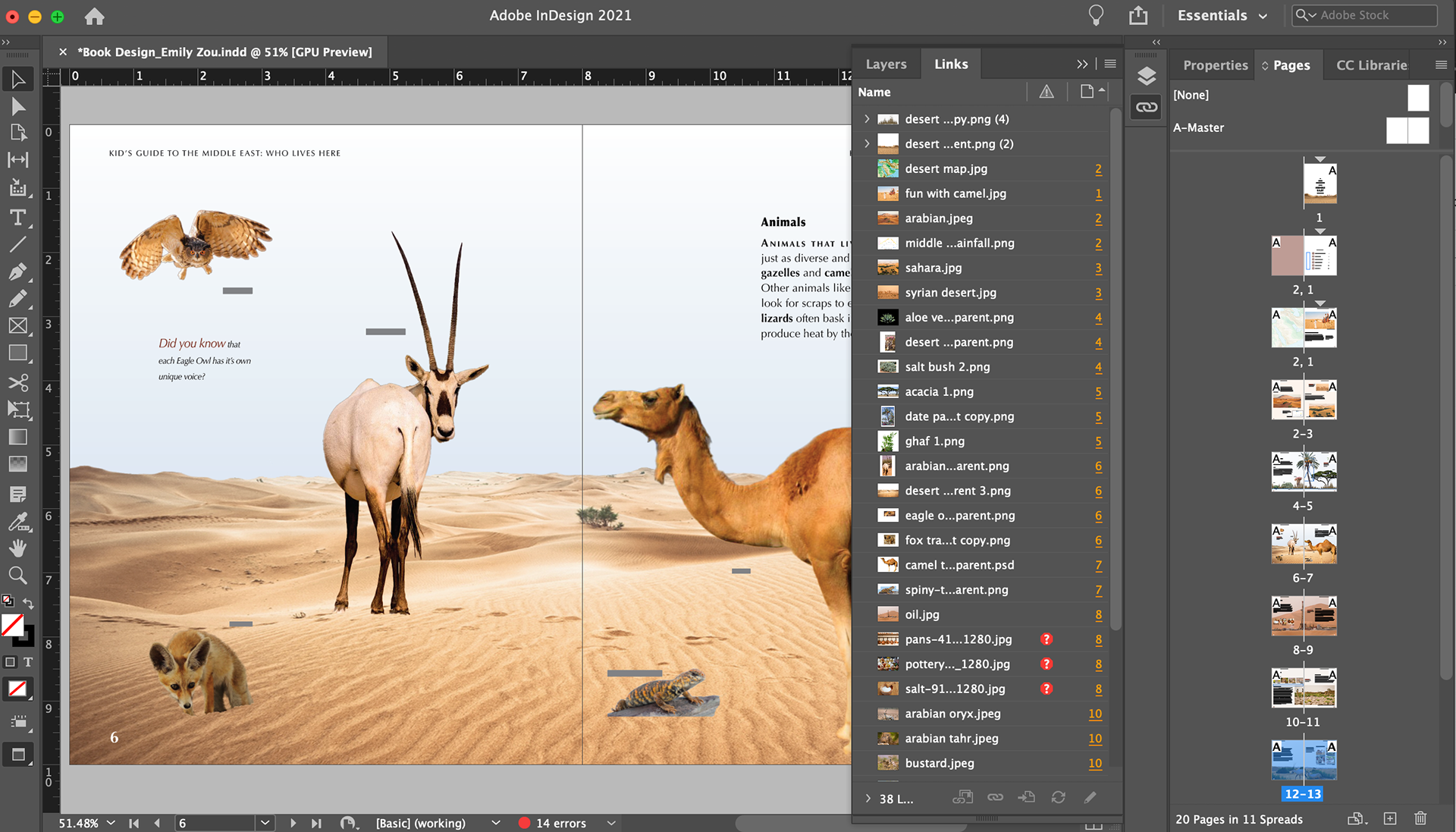
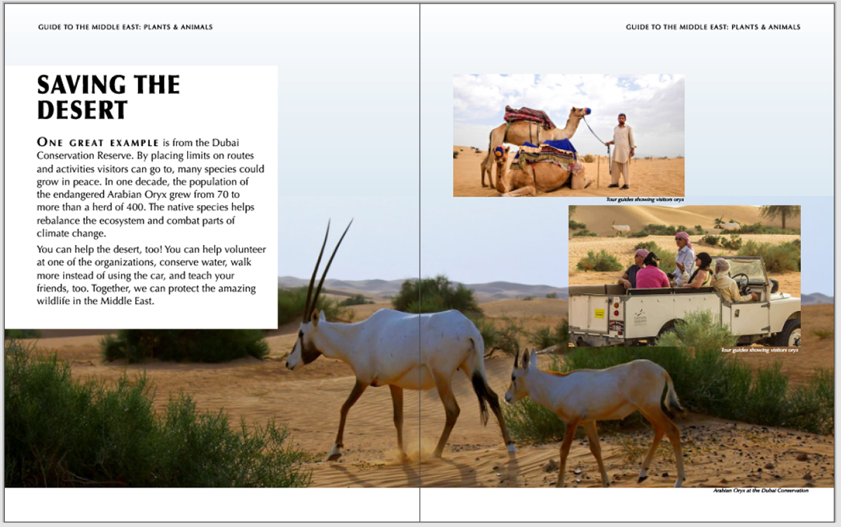
After a few YouTube tutorials of using photoshop and hours of looking for images that has around the same color palette, I mashed together a lot of cutouts of native plants and animals to the Middle East. Each spread with cutouts took me many sleepless hours, but I had a lot of fun putting them together for a cohesive design.
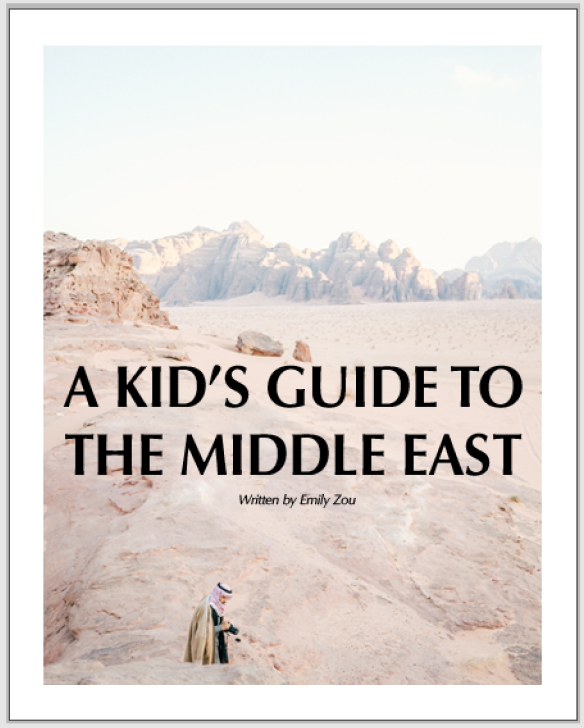
Also, I used the professor's tips on keeping content consistent but varied. If you look closely, you can see that the most important content and images hangs around at a 2/5th horizontal line across the pages like clothes on a line. I also shrank the font size, redesigned the cover, and added color to the table of contents.

Reflection
This was the first time that I got to design a physical book. I had a lot of fun learning new tools such as Photoshop and skills such as calling in to order a book. With that being said, this project was one of the most difficult all semester because it used all concepts that I learned such as visual texture, grids & chunks, whitespace, and more.
Perhaps it was also much more difficult because I wrote all the content myself, which was not required. However, I did it because I could not find any content that was geared towards explaining the nature of the Middle East to children that matched my design. In addition, I wanted to create something that I could fully copyright.